Reoctions: A Modern Display Font for Digital Branding
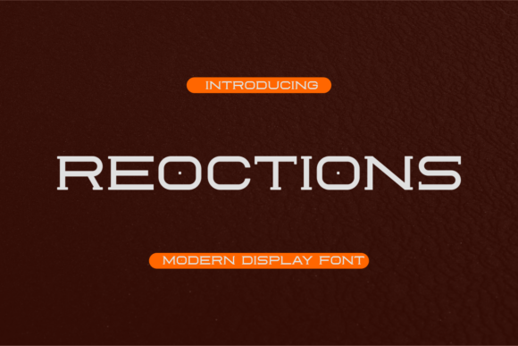
As a UI designer who ships landing pages, SaaS dashboards, and e-commerce experiences daily, I pay close attention to how typography shapes perception before a single word is read. Reoctions stands out—not as background filler, but as intentional visual punctuation. It’s a display font with a distinct personality: modern enough for tech-forward brands, yet whimsical enough to soften luxury or creative positioning. Its letterforms balance geometric structure with subtle organic quirks—slight tapering on terminals, confident x-height, and open counters that hold up beautifully at larger sizes on screen.
Reoctions isn’t built for body copy. That’s by design. Its strength lies in commanding attention where it matters most: hero headlines, section dividers, CTA buttons, and branded banners. On a product landing page, pairing Reoctions with a neutral sans serif like Inter or Manrope creates immediate hierarchy—your value proposition lands first, then supporting details follow with clarity. I’ve used it successfully for boutique online stores where the font adds warmth without sacrificing polish, and for coaching websites where its friendly confidence reinforces approachability and expertise in equal measure.
Visual rhythm matters just as much as contrast. Reoctions excels in breaking monotony. When applied to a testimonial carousel header or a course module title, its character gives users a subtle cue: “This section is special.” That works because it’s not loud—it’s *considered*. Unlike some decorative fonts that overwhelm or distract, Reoctions maintains legibility even at 48px on mobile viewports, especially when paired with generous line height and appropriate letter spacing. For dark-mode interfaces, I recommend testing its weight against background contrast; its clean outlines render well on deep charcoal or navy, particularly with light text treatment.
Readability in context is non-negotiable. Reoctions performs best at sizes 32px and above for desktop headers, and 28px minimum for mobile hero text. Avoid using it below 20px—even in bold—since fine details (like delicate crossbars or curved joins) begin to blur on lower-DPI screens. It’s also not ideal for long button labels (“Get Started Today With Our Free Trial”)—but perfect for short, high-impact CTAs like “Launch” or “Explore.” In image overlays, I use it with subtle text shadows or semi-transparent background bars to ensure contrast meets WCAG 2.1 AA standards.
Font pairing is where Reoctions truly shines. Think of it as the lead vocalist—not the backing band. Pair it with a highly legible sans serif (e.g., Poppins, Lato, or system fonts like -apple-system) for paragraphs, navigation, and form labels. For editorial-style digital products—a newsletter site or content platform—you might layer it over a warm serif like Cormorant Garamond for subheads, letting Reoctions anchor top-level sections while serif supports narrative depth. The key is contrast without conflict: Reoctions brings energy; your secondary typeface brings stability.
For brand consistency across digital touchpoints, Reoctions holds up remarkably well. Use it for logo lockups (especially wordmarks), social media cover graphics, email headers, and even app splash screens—provided you’re licensing correctly. Most versions include standard OpenType features: stylistic alternates, ligatures, and multilingual support covering Latin-based languages (including extended accents for French, Spanish, and German). Check whether your license includes WOFF2 files—critical for fast-loading webfonts—and confirm whether variable font support is available. If you're delivering templates or white-labeled dashboards for clients, verify commercial usage rights cover embedded web assets, not just static mockups.
Real-world application tells the story best. On a recent portfolio site for a ceramicist, Reoctions introduced playful sophistication to gallery titles—its soft curves echoed hand-thrown forms without feeling literal. For a fintech startup’s pricing page, we used it only on the plan name cards (“Starter,” “Growth,” “Enterprise”), instantly differentiating tiers while keeping feature lists in crisp Roboto. In both cases, users reported stronger recall of section names and higher perceived brand cohesion. That’s not accidental—it’s what happens when display typography aligns with voice, audience, and interface intent.
One practical note: always test Reoctions across devices before launch. Its rendering can vary slightly between Chrome (excellent hinting), Safari (clean but occasionally tighter spacing), and Firefox (solid, though sometimes less nuanced at small sizes). Adjust tracking manually if needed—+20–40 units often improves flow in headlines. And never skip loading fallbacks: declare font-display: swap in your @font-face rule so users see readable text immediately, even while Reoctions loads.
Reoctions isn’t about being “fun” or “trendy.” It’s about intentionality—choosing a display font that does more than look good. It strengthens visual hierarchy, supports brand tone without explanation, and invites engagement through expressive yet controlled form. Whether you’re designing a one-page conversion funnel, a subscription-based course platform, or a brand kit for a creative agency, Reoctions delivers distinction without distraction. And in today’s crowded digital landscape, that kind of clarity is rare—and valuable.
- Best for: Hero titles, section headings, logo wordmarks, digital banners, and short CTA labels
- Avoid for: Body text, data tables, small mobile buttons, or dense navigation menus
- Pair with: A highly legible sans serif (for UI clarity) or a refined serif (for editorial depth)
- Licensing tip: Confirm web embedding rights cover live domains, client sites, and SaaS platforms—not just design tools
- Technical check: Verify WOFF2 support, OpenType features, and language coverage before purchase